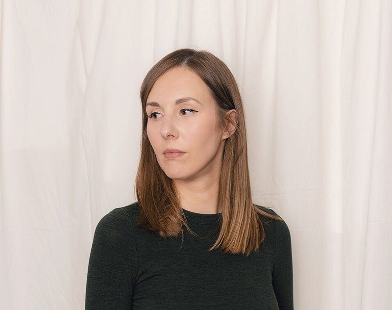
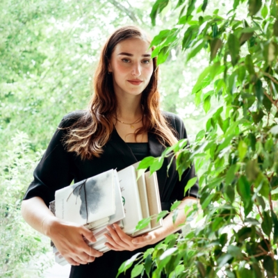
Customer in the spotlight: Tina De Souter

Several years ago, Tina De Souter founded her own business with a focus on book design, graphic design and bookbinding. She did so after a successful test year as a student self-employed. Since then, she has become one of our favorite designers. Someone with drive, passion and exceptional creative talent. High time for a meet-and-greet on a sunny terrace in hometown Mechelen!

Tina with some of the books she already had printed with us. © Sven Goewie

Graphic design, book design and bookbinding-why the focus on those three pillars?

‘I am someone who needs variety to stay sharp. In addition, the knowledge of different fields provides many benefits to both myself and my clients. Because I master handbook binding, for example, I understand the anatomy of a book. For customers, that know-how offers enormous added value. Because of my expertise in binding and paper types, I am able to advise them even better. At the same time, I can stay creative in the meantime.

© Jochen Verghote, LucidLucid

How did you get in touch with Buroform?

“When I was looking for a printing company for my first book ‘Onion,’ a teacher tipped me off to Buroform. At the time, I had a clear vision of what that book should look like. When I visited you the first time to go over everything, I was showered with printing samples and paper samples. Then, with combined forces, we really made something very beautiful out of it. Since then, I have continued to return.

What advice do you give your clients most often?

‘That they can trust me blindly, haha. (laughs) Many customers want control during every step of the printing process: the choice of printing technique, the color palette, the type of linen or paper, you name it. Or they ask for a proof before the book actually goes into print, but such a thing is very expensive. Of course, as a customer, you should have a say. During a collaboration, I always meticulously go over the various possibilities through samples and other examples. Except that each choice remains only one facet within a larger whole. Because of my experience, I see more than just those swatches; I really see the finished book before me. Therefore, the advice: trust me, because I know what it takes to get a great result.

How do you describe good printing?

‘That’s easy: good printing is printing that does full justice to the content. As a photographer or artist, it must be terrible to receive a design that does not fit your identity at all after all the hard work. I really think of an art or photography book as a printed exhibition. A browsable space where you should be able to experience the work as authentically as possible. Sometimes the content lends itself to a sober, no-nonsense design, but sometimes it may be more intense and colorful. I strive to make each book unique. You as a printing company are also of great value in this, by the way. Because of the know-how available, the personal guidance throughout the process and the passion from paper types, printing techniques and binding methods.’

What evolution do you see in the market for high-quality books?

‘People have said to me before, “Oh, you make art books? Do you really do that as a full-time job?” And then you can see from their facial expression that they wonder how I can make ends meet with such a job (laughs).

You should know: the printed book is not dying out, the market is just shifting. Disposable printed materials such as leaflets and flyers are increasingly being replaced by online advertisements, and novels are being reduced to e-books. But art books remain a kind of calling card for artists because it makes their work tangible. An art book is also much more affordable than a work of art, and because of the high circulation of books, it allows for wider distribution of their work.

What are your favorite techniques?

‘Binding technique Otabind®: In this binding method, there is an opening between the spine of the book and the spine of the cover. Because of that opening, this softcover binding falls open very nicely.

Binding technique hardcover: This technique has a kind of fanciness that no softcover can match. Only in my world, hardcovers are already used so often that sometimes you stand out better with an original softcover.

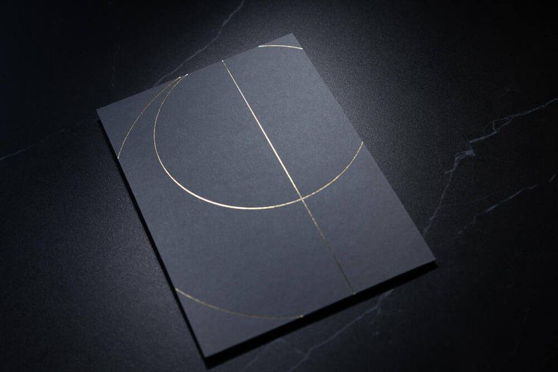
Favorite printing technique: hotfoil: I’m really a sucker for hotfoil. I try to foist that on every customer. (laughs) It has been scientifically proven to attract our eyes. Walking past it, the image shimmers in the corners of our eyes, making it seem to move. Fascinating!

Customer in the spotlight: HNST. The world’s most sustainable jeans

Buroform pays close attention to sustainability. Consequently, there is little as inspiring as collaborating with brands doing the same thing. A little while ago, we came in contact with HNST. Like us purebred Malinois, but above all an innovative denim label with a great sense of social and ecological responsibility. HNST is developing circular jeans that consist of more than half recycled materials. A Q&A with Eva Engelen, one of the faces behind the brand.

Hey Eva, can you briefly explain what exactly HNST stands for?

“HNST was created in response to the environmentally damaging and socially irresponsible operation within the apparel industry. The jeans sector in particular poses a major problem in this regard. Jeans may be the most polluting garment in our closet. Each pair of pants requires a huge amount of water, energy and chemicals. On top of that, jeans are often produced in countries with deplorable working conditions.

With HNST we take a completely different approach: our jeans consist of 56% recycled cotton from old jeans, supplemented by a portion of new fibers. Therefore, the ecological impact is a lot lower. For example, per pair of jeans we save about 7,000 liters of water and emit a good three-quarters lessCO2. Manufacturing is also done entirely within Europe, making the chain quite a bit shorter compared to other brands.”

HNST is an honest jeans brand that combines the best of both worlds: the brand offers stylish jeans styles that are also 100% circular. A process that founder Tom Duhoux and co-founder and CEO Lander Desmedt say should be universal. That is precisely why HNST was given the tagline “nothing to hide.

HNST would make the world’s most sustainable jeans: is that the ultimate goal?

“Our big goal is actually to make the apparel sector completely circular. Of course, you don’t do that in one day. Jeans is the starting point for us, but we go very far with that. Toxic chemicals on reused jeans, for example, we have them removed integrally. We also choose screw-off buttons, labels composed of cellulose, embroidered rivets and inside pockets made of recycled white T-shirts. We also communicate very openly about our methods. On our website you will find all the info about the composition of the fabrics and data about our production partners and price setting. You rarely see something like that, but for us it’s part of our story.”

People can also bring in their old jeans to you themselves?

“That’s right. For the collection of old jeans we cooperate with the Circle Shop. In addition, you get €15 when you bring in an old pair of HNST jeans to us. The base price of our jeans is €135 euros. So you can actually see that €15 as a kind of deposit.”

HNST came to us for new hangtags. How does Buroform fit into your story?

“We want to infuse our way of working into everything. This means that we only work with partners who meet our criteria around sustainable business. Buroform fits perfectly into that philosophy because it itself has high standards in that area.

The hangtags we had you make for us consist exclusively of recycled industrial paper, but in time we want to go a step further. We are toying with the idea of developing hangtags that also have their use in everyday life. I can’t say much more about it yet, but there are many great things coming up to work on together. (laughs)

Customer in the spotlight: Studio Boiler

For ten years, graphic designer Astrid Vanderborght went through life professionally as Astrid.graphics. Recently that has changed and she reached her creative boiling point under the name Studio Boiler together with a handful of like-minded people. Boiling, building and branding, that’s the motto of this new churning collective. Fireworks insured.

Hey Astrid, with Studio Boiler you’re breaking new ground. Tell us more about it?

“I worked as Astrid.graphics for 10 years, but lately I noticed it was running out a bit. A new schwung was needed: a different name, a fresh look-and-feel, a whole new vibe. With Studio Boiler, I gather a number of creatives around me, each with their own specialty. Together we are able to build a brand from a to z. That starts with rolling out a brand identity: from logo and corporate identity to tone-of-voice and imagery. In addition, we translate that brand identity into a complete online and offline concept: website, social media, templates, printing, signage, and so on.”

How did you get in touch with Buroform?

“For large-format printing, I have been working with NOOOMI (Naomi Steylaerts) for a long time. She has a very broad network and had recommended Buroform to me in connection with a specific assignment. After that first introduction, I quickly received an invitation to the first edition of Cafe Cliché. Afterwards, I was really completely sold. Buroform thinks with you and does not shy away from any creative challenge. I find it a tremendous value to have our designs printed with you.”

So what makes Buroform stand out for you?

“The huge range of paper and printing techniques. But also the way of working. People help think about how best to translate a design to paper. That is quite exceptional. I notice a strong feel for the living world of graphic designers, which is very nice to experience.”

What is the importance of good printing to you?

“Actually, it’s very simple: printing can make or crack your design. Beautiful, high-quality printed matter adds undeniable value to your designs. A lot of time and energy goes into every project. A design that comes into its own when printed, that makes me genuinely happy.”

How do you personally experience the relationship between designer and printer?

“I experience that as two-way traffic. You give input on what is possible and new in the printing world. We take that input into our designs. This creates an interesting cross-pollination and you can keep challenging each other. It is precisely this healthy interaction that leads to clever and innovative results.”

Customer in the spotlight: Samuel Vanhoegaerden

From Warhol, Bacon and Lichtenstein to Panamarenko, Dotremont and Ensor. Those who like to savour modern art should visit Samuel Vanhoegaerden in Knokke . In his gallery you can regularly admire exhibitions of the greats of the world. Not infrequently, those exhibitions are accompanied by an equally handsome art book. And not infrequently we get to print that!

Whence your fascination with modern art?

Samuel Vanhoegaerden: “In itself, I never intended to get into the art world. I studied economics and wanted to work in banking. Until I was introduced to modern art through my former father-in-law. Twenty years ago, I then started buying up small pieces myself. Initially I worked without a gallery, but after about four years I settled in Knokke. There you reach the right audience and have the opportunity to build long-term relationships.”

What determines whether or not to include an artwork in your collections?

Samuel Vanhoegaerden: “Because I purchase everything myself, I must first and foremost like a work myself. I always choose based on my own taste, historical importance and aesthetic value. Only when those three parameters are met do I include a work or collection in my gallery.”

A lot of solo exhibitions are accompanied by a beautiful matching catalog: why this love of art books?

Samuel Vanhoegaerden: “When I organize an expo, I want everything to be right. From the framing to the invitations, it was all very well thought out. When I exhibit a fine solo collection, I also often find it adds value to catalog those works. That approach also appeals to many people. The Codex Panamarenko from a few years ago, for example, is a sought-after book now. Just the other day it was offered for sale for 700 euros on an online auction site.”

How important is a good print partner to you?

Samuel Vanhoegaerden: “I myself know very well what I want. On every art book I have my own vision, but I also really like to be guided by people with expertise. I have known Buroform for more than twenty years now and know what to expect. There is that little extra possible. You can’t make many choices as an outsider if you don’t have a graphic design background. At Buroform I know that the work is professional and customer-oriented, which means that much more is possible. There is a very nice work ethic. A kind of sense of honor that I find in everyone involved in the printing process, from the designers who handle the layout to the people behind the printing press itself. Every employee is genuinely proud of their work and radiates it. That works very inspiring.”

David Legrève has first photo book printed at Buroform

Mechelen-based press photographer David Legrève recently released his first book. ‘Soon Opening’ is his personal account of the past corona year. A unique time document that beautifully captures the entire situation. And we were allowed to print this photo book.

MECHELEN Photographer David Legrève presents his first book of photographs Weldra Opening with an exhibition at The Preachers
David Legrève presents his first book of photographs Weldra Opening.

“A week after the first lockdown, I started working on this project,” David Legrève says. “On March 13, the crisis broke out, which obviously affected my daily work. Initially, I was afraid to come in contact with others. I didn’t want to be infected, let alone infect people myself. I quickly took my shots and hurried home. Until I began to realize that the whole situation was very fascinating on a visual level. Typical assignments like photographing a wedding anniversary or a new store suddenly took on a different dimension. Those visible changes I wanted to document. After first closing my eyes out of fear, I suddenly discovered another world.”

Sleeping dog key moment

If you visit the Predikheren in Mechelen today, you can admire a selection of the sculptures. Fourteen photographs will be on display at the city library until Feb. 21, as a preview of the 100-page book. From old folks celebrating an anniversary behind glass to an online birthday party and the decontamination of St. Rombouts Cathedral. + Perhaps one of the most remarkable photos is of a sleeping dog in an abandoned store window.

“This is the key image of the series,” he said. “That peacefully sleeping dog evokes a certain peace, quiet and beauty. At the same time, a certain menace emanates from it: is the animal still alive or not? That negative undertone is typical of the unreality of the crisis. Yet it is this image that freed me from my fear. I was suddenly ready to take more time for my photographs.”

The photographs are an emotive representation of life as it currently is: full of despair, uncertainty, absurdity.

Buroform may print photo book

And then we got to print David’s photo book! In collaboration with photographer and graphic designer Tina De Souter, who oversaw the entire process from composition to printing. “I am very satisfied with the result and actually with the cooperation in general,” Legrève smiled. “I think the speed and focus with which our questions were answered is a big plus. The book really exudes what I want to say. The cover consists of a rough natural cardboard into which the opening image is punched. In addition, we chose an open spine. You can see the glue and binding, which goes very nicely with the cover image: an unfinished showcase in which the words “soon opening” are written. The combination of that raw and drab image and the artlessness of the book immediately capture the mood I wanted to convey.”

The combination of the raw and drab image and the unaffected look-and-feel of the book immediately captured the mood I wanted to convey.

Client in the spotlight: Studio Anorak

If you were there during our second Café Cliché edition, you could already meet An Eisendrath. Under the name Studio Anorak, she has been working as a graphic designer for 20 years. Her portfolio includes such names as City of Antwerp, Brussels Philharmonic and Design Flanders. In addition, she is a type-print lover from the very beginning. About the use of old printing presses, she regularly gives workshops and lectures. These are highly recommended: An usually takes you to the Museum Plantin-Moretus, the place to be if you are passionate about old printing techniques.

You are primarily a print designer: why this passion for paper?

Studio Anorak: “Ironically, I graduated as a web designer. Before I became self-employed, I worked for a long time in a small design studio, working on animations: great work, even better colleagues, and yet I missed something. Sitting in front of the computer all day wasn’t for me. I need to be able to hold things and get my hands dirty. The tangible aspect of printing has always fascinated me. Guiding a project from A to Z, seeing which paper and printing technique best suits a design, that’s what I do it for.”

And of all these techniques, type printing stands out for you?

Studio Anorak: “No doubt about it! I’m someone who works very typographically anyway. The history of typography has always strongly appealed to me. There also lies the basis of typo printing. In addition, I have something with old machines and printing presses. I like traditional work because it gives a lot of creative freedom. I now have two old type printing presses at home, which I use regularly for printing my own work. And, of course, I regularly give workshops. Sometimes also in collaboration with print historian Patrick Goossens. He has an impressive typographic private collection at his disposal.”

How did you get in touch with Buroform?

Studio Anorak: “In the past, I have created a number of designs for Buroform. Then we started working together more and more. One project I’m very proud of in that regard is the art book on the occasion of the fifth anniversary of D.A.T.E. We were on a tight schedule and fairly limited budget, but the result is overwhelming. During that collaboration, I really experienced how much knowledge and expertise there is with you guys.”

How do you look back on Café Cliché, your most recent collaboration with Buroform?

Studio Anorak: “Because Café Cliché was about letterpress, it was a prestige project for me anyway. Normally, the March event would have gone on in the print shop. Buroform had asked me to design a series of inspiration cards to be used during the event. But then came the lockdown, which prevented me from seeing the final result. Until a while back. When Café Cliché was transformed into an online event, I suddenly got those cards in the mail. I opened the package and was really blown away by the quality of the printing: so beautiful! As a designer, you have a certain idea about the effect of a design. Then, when you find that everything is as hoped and the printing actually enhances your design, it gives you tremendous satisfaction.”

Customer in the spotlight: UNIKAVI

Who gets to say it better than our customers themselves? Therefore, we are happy to let them speak wholeheartedly at this place. About themselves and about our printing, because every project is teamwork! Meet Philip Hendrickx of UNIKAVI – Brand Builders, specializing in marketing for the hospitality, hospitality and event sector.

From the birth of the Internet, Philip Hendrickx has been active in the marketing industry. With years of experience, he invariably ensures a creative upgrade of your brand or organization. For star restaurant Zilte by Viki Geunes, located on the top floor of the Antwerp MAS (Museum Aan de Stroom), UNIKAVI provided a total picture: a completely new visual identity both online and offline. After all, the style of communication helps determine the perception of a brand or business. Buroform took care of the printing under the professional supervision of our creative paper & print expert Valérie Maes.

Philip from Unikavi

What makes Buroform stand out for you?

“The personal contact, the great choice of materials and the expertise. We were advised throughout the entire process. Buroform is not afraid of custom printing. It creatively shapes our wishes. Challenges are never shunned. Your creative expert Valérie Maes was a rock. Thus, our collaboration ran partly in corona time and as soon as it could, she came right up to our office to explain new modified versions in real life.”

What is the importance of good printing to you?

“Print offers great value in terms of the feel and experience of a business or company. Much is being digitized, but that does not guarantee the same experience. The tangibility of print remains of tremendous importance. Good printing demands to be touched. Feel free to call our joint achievement sensory marketing. The total experience is central to the revamped Zilte and we carried this through into the visual identity.”

How do you see the relationship between you and Buroform?

“Communication and interaction are important. But efficiency is just as important. Ideally, a printer is able to immediately understand what the designer wants to convey in terms of feeling with the printed matter. And also be open to experimentation. That’s where Buroform comes in. I know I can always expect that little bit more.”

Check out the full case of Zilte.

The total experience is central to the revamped Zilte and we carried this through into the visual identity.

Customer in the spotlight: Studio 19.09

Who gets to say it better than our customers themselves? Therefore, we are happy to let them speak wholeheartedly at this place. About themselves and about us, because every project is teamwork!

Several years ago, Nathalie Van Durme was working as a graphic designer for BO Magazine, our top lifestyle magazine. It was during this period that she also started Studio 19.09, a freelance project that has since grown into a full-fledged branding and design agency. Today it is three creatives strong and simplicity, clarity and character are typical. Pearls from the portfolio that might ring a bell? Lunch hotspot Barchel in Antwerp, handbag label Commori and interior design store Tillborg in Brasschaat.

What can interested parties expect from Studio 19.09?

Studio 19.09: “We help startups, entrepreneurs and companies tell their story using a strong visual overall concept. In other words, we build the brand from a to z, with everything that goes with it. In this, we go as far as necessary. From the complete corporate identity and logo to a website, signage and even interior and product design. For each aspect, we appeal to the right people, internal or external, with the goal of bringing the message to life in the most inspiring way possible.”

That means you have to know your customers inside out?

Studio 19.09: “True. I am a people person myself and that is strongly reflected in the way I work. My approach is very personal. I want to get to the bottom of people, because I believe that a good story can only be told if you know what lies beneath the surface. Who is behind that face? What is that person’s philosophy? What clothes is he or she wearing? You take that info and values into your concept. The nice thing is also that the people I work for are usually very passionate. That inspires enormously.”

How can print contribute to that overall story?

Studio 19.09: “I am not satisfied until every aspect is right and everything is aligned correctly. Details make a design. The same is certainly true of printing. Our designs often have a very personal touch, which I want to see reflected in the tangible version. It is important to me that the printer thinks along with me, and I experience that enormously at Buroform. There is very personal work, which is not only unique for a larger printing company, but also just makes your own work better.”

Which collaboration are you most proud of?

Studio 19.09: “For Contraload, I created the corporate identity. The printing was done by Buroform and that collaboration went wonderfully. I introduced the company myself and everyone was immediately on the same page. Another nice little project is Tillborg, where the printing also contributes very much to the overall experience. In the design, a pinkish orange and royal blue are the core colors. These had to be reproduced as faithfully as possible in the printed matter, and that worked out excellently!”

More of this: follow @studio19.09 on Instagram.

Customer in the spotlight: Studio Posen

Who gets to say it better than our customers themselves? Therefore, we are happy to let them speak wholeheartedly at this place. About themselves and about us, because every project is teamwork!

Sophisticated, minimalist yet warm. What Studio Posen conjures out of the hat is a feast for the eyes every time. This creative studio is the brainchild of Kristel Posen, an architect by training but professionally grown into a graphic designer. Around her she gathers a multidisciplinary team of creatives and together they put brands on the map. From logo to corporate identity, social media to website and much more. Studio Posen develops everything needed to visualize your story or message and bring it to life.

How did you get in touch with Studio Posen with Buroform?

Studio Posen: “A long time back I had birth announcements printed with you for a client. I was suitably impressed by that. The quality of the printing and foil printing was impressive. When I needed some items for a recent project Labelchic, I didn’t hesitate. I contacted Valérie, who immediately invited me for an interview. “Then you get a much better idea of the possibilities,” it sounded. I found that quite disarming. At a lot of printing companies, orders soon run through mail. That works, too, but you never get as much information and inspiration as during a face-to-face meeting.”

What makes Buroform stand out for you?

Studio Posen: “The warm contact. Buroform really invests in its clients. That personal touch makes you much more likely to return. I now know that I get advice when I knock on your door, that every contact is a new discovery. There is so much knowledge, there are so many opportunities for advice, and everything with a smile. That’s a huge plus.”

What is the importance of good printing to you?

Studio Posen: “The first impression is everything. Print materials help determine the reputation of your brand. When a potential customer gets their hands on your magazine, its quality helps determine how that man or woman will feel about you. Well-crafted printing helps connect with your target audience. It helps to make your message tangible, to give it more power.”

How do you see the relationship between designer and printer?

Studio Posen: “Good printing is simply a necessity for the right perception of your designs. In addition, a good printer fills in the technical knowledge you lack yourself. After my first conversation with Valérie, she arranged for several paper representatives to visit our studio. That way your world expands, you discover new avenues, you learn. I found it fantastic that you took the time to bring those people to me. It’s also initiatives like that that make you stand out as a printing company.”

Check out the full case of Labelchic, Tache de beauté and Studio Posen.

Customer in the spotlight: studio basil.

Who gets to say it better than our customers themselves? Therefore, we are happy to let them speak wholeheartedly at this place. About themselves and about us, because every project is teamwork!

studio basil. is a branding agency in Brussels, founded by Ann-Sophie Maeyaert. She graduated as an interior designer, but after her studies chose to pursue an alternative creative path. She moved to London, studied graphic design and then worked in several agencies and as a freelancer. The latter activities also gave birth to studio basil. which she transferred to Brussels about two years ago. The agency operates mainly in the retail and hospitality sector, creating visual identities grafted onto a strong overall concept. “We assist companies in developing their entire corporate identity. That can go a long way, from coming up with a name and working out a logo, to the overall branding strategy, product development and so much more.”

How did you get in touch with Buroform?

“I only moved from London to Brussels two years ago, so I’m still honing my network. At some point online I stumbled across a number of Buroform projects. All of them very nice things that triggered me to have a listen to see if something was possible together. That’s how I came into contact with Valérie, your printing expert. I must say: that meeting blew me away. Valérie was immediately on board with my story. She exudes enormous knowledge, insight and enthusiasm, which is very inspiring.”

What makes Buroform stand out for you?

“I think customer friendliness is incredibly important. Buroform puts a lot of effort into that, you notice that in everything. And furthermore, the company simply exudes trust and that is after all the basis of all collaborations. I know I can count on your people, a feeling that was only strengthened after the first collaboration.”

What is the importance of good printing to you?

“My work hinges on beautiful, quality print work. You never get the same effect on a screen as you do on paper. Every design has a certain layering. You are trying to convey your message or that of your customers in various ways. Good printing shows those different layers. It also makes all the details you’ve thought about for so long become tangible. Color combinations, a certain type of paper, a printing technique, they ensure that your design is experienced as intended.”

How do you see the relationship between designer and printer?

“The connection between a graphic designer and printer is crucial. As a designer, you have some technical knowledge, but you never know everything. On the contrary. A printer who can share knowledge is a huge asset. I had that experience with Valérie. She is very knowledgeable. The knowledge you gain by consulting, by working together is priceless. It allows you to take different paths. You can suggest things to your own clients, your own designs become better, because you gain insight into new things. From that point of view, an initiative like Café Cliché is very important. Such moments of inspiration ensure that you keep learning and discovering as a graphic designer.”